
If you’ve ever worked on a Salesforce project be it a Lightning Web Component, a Visualforce page, or even a basic Lightning App, you’ve likely come across the term Salesforce Lightning Design System (SLDS).
But what is SLDS and why is it important?
The Salesforce Design System is like a toolkit for Salesforce admins, designers and developers. It is packed with guidelines, reusable components, and standards to help create consistent and polished digital experiences. Think of it as a playbook that ensures everything built within Salesforce looks and feels seamless.
Back in 2015, Salesforce introduced SLDS 1 to help designers and developers create user interfaces that seamlessly match the Lightning Experience. Now, with SLDS 2 (beta) and the Cosmos theme, Salesforce gets a fresh new look faster navigation, improved performance, and a more user-friendly experience for everyone.
How To Enable the New UI?
If your Salesforce org was created before February 2025, the new SLDS 2 Cosmos theme won’t be available. To explore the new features, simply spin up a new Salesforce developer org and give it a try!
To learn more about how to create a free Salesforce developer org click here
Once your Salesforce org is ready, head over to Setup > User Interface > Themes and Branding to check it out

Simply select the Salesforce Cosmos theme and activate it.


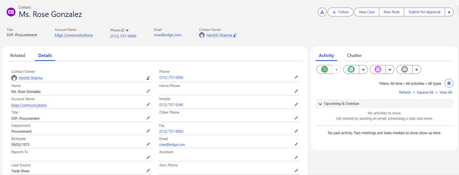
Head to the top right corner, click on View Profile, and you’ll see that the display density is set to Comfy by default.

Open any Salesforce record. In this case, we have opened a Contact record and you’ll notice the fresh new UI. Buttons and sections now have softer, more rounded edges for a modern look.

Now we will switch to Compact view and see what the UI looks like.
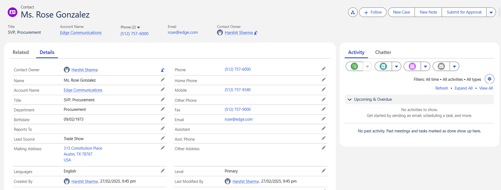
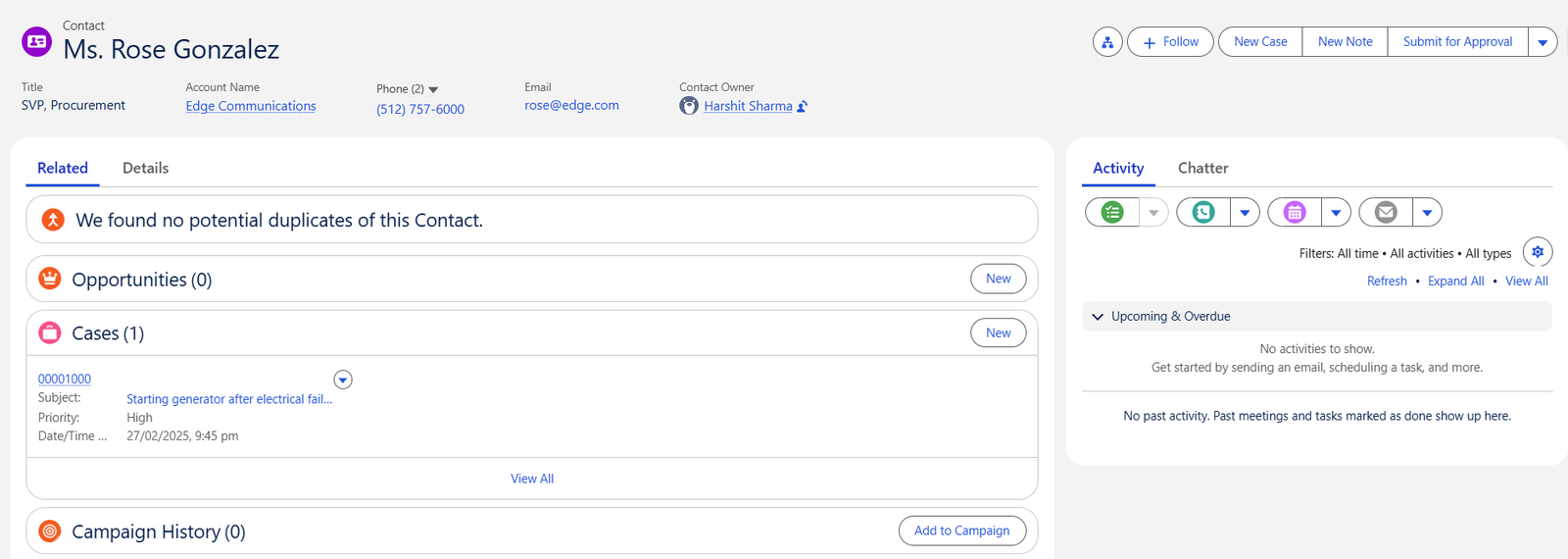
Switch between Comfy and Compact views, and you’ll notice that Comfy has more white space, giving the UI a more open and airy feel while Compact view can help you see more information in a single glance.
Products Not Yet Supported by Salesforce Cosmos:
- Salesforce Mobile App
- Builders like Flow Builder and Lightning App Builder
- Visualforce Pages
- Certain Salesforce Console Features
Also Read – Salesforce Spring’25 Release Updates
FAQs
1. What is SLDS in Salesforce?
The Salesforce Design System is like a toolkit for Salesforce admins, designers and developers. It is packed with guidelines, reusable components, and standards to help create consistent and polished digital experiences.
2. How to use SLDS in Lightning Web Components?
SLDS is built right into LWC. Just add SLDS classes directly in your component’s HTML, and you’re good to go.
3. Can we use SLDS on the visualforce page?
Yes, you can use SLDS on a Visualforce page, but unlike LWC, it’s not available by default. You’ll need to manually add the SLDS stylesheet by referencing it on your Visualforce page.
Conclusion
SLDS is more than just a design system. It is a powerful toolkit for Salesforce developers and designers. With the new Cosmos theme, the Salesforce UI gets a fresh, modern look with updated elements throughout.