

Data Sources and Build Elements are key components in FlexCard design. Data Sources allow you to select from various sources to retrieve information from Salesforce objects or external databases. Build Elements offers a selection of interactive components to create your customer interface within FlexCard.
Data Sources in Flexcard
1. DataRaptor Data Source
- In the FlexCard Designer, click “Setup” in the “Setup Panel”.
- From the “Data Source Type” dropdown, choose “DataRaptor”.
- Click on the “Interface Name” field and select the desired DataRaptor Extract.
- If you want to pass data to the DataRaptor, click “+ Add New” next to “Input Map”.
- For example, to send the FlexCard’s context ID, use the
{recordId}variable.


2. SOQL Data Source
Choose “SOQL Query” as the data source type and write your SOQL query in the provided field. (Ex: SELECT Id, Name, StageName, CloseDate FROM Opportunity ORDER BY AccountId Limit 5).


3. Integration Procedure Data Source
In the FlexCard Designer, click “Setup” and select “Integration Procedures” from the data source list, pick an existing Integration Procedure to use by clicking in the “Name” field.

4. SOSL Data Source
Choose “SOSL Search” from the “Data Source Type” dropdown in the “Setup” tool. Type what you want to search for in the “Search For” field. (Ex – I want to search the contact to include – Salesforce developer).
Pick the fields you want to search in from the “In” dropdown. (Ex – Name Field )
Click the “sObject” field and pick an object. (Ex-Contact). Choose the specific data fields you want from the “Field” dropdown. (Ex – Email)

5. Custom Data Source
You can add your data directly into the FlexCard, instead of using an external source. This is helpful for testing purposes or when you don’t have access to other data yet.
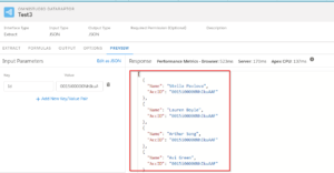
Choose “Custom” as the data source type and write your custom data in JSON format into the “Custom JSON” field and Click on “Save and Fetch”.


Build Elements in Flexcard Designer
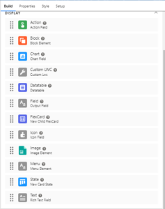
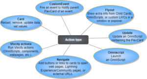
1. Action
Using the Action feature, you can generate various actions such as initiating an OmniScript, directing to a webpage or application, presenting a flyout, triggering an event, and more. It defines text or a button that performs a specific task upon being clicked.

2. Block
Block allows for the grouping of elements within a collapsible container. (Ex- For instance, you can group the basic information of an Account together and separately group the Contact information for that account.)

3. Chart
It exhibits data in the form of a visual chart.

4. Datatable
Present the information retrieved from a data source in a tabular format on a FlexCard. (Ex- Opportunity Cases as a table)

5. Field
It presents the data fields retrieved from a data source on a FlexCard. (Ex – Display Stage information for an Opportunity.)

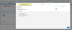
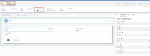
6. FlexCard
Within a Parent FlexCard’s state, you can embed a Child FlexCard. The Child FlexCard can have its own source of data, or it can also use the data source of Parent FlexCard. This is useful when the child requires access to the same data as the parent
(Ex- In the below image – MyDemoFlexCard is the Parent and sampleCases is the Child FlexCard.)

7. Icon
It displays a Custom or Salesforce SVG icon that can be associated with a specific action.


8. Image
It integrates a custom image from various Data Sources, including:
- Uploading an image
- Using images from your organization’s library
- Linking to external image sources


9. Menu
Create drop-down menus with customizable actions, allowing users to choose and trigger various functionalities from a central location.

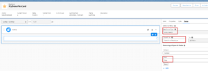
10. State
FlexCards allow adding different layouts and interactions based on conditions using states. These states utilize data sources and build elements to create distinct content.
You can either drag a new “State” element onto the canvas or clone an existing one. Each state can have a unique name (internal use) and can display specific elements based on defined conditions.


11. Text
This element combines plain text and data from Data Sources using a rich text editor. This editor allows you to:
- Merge data fields: Insert data from your FlexCard’s data source using curly braces (e.g., {Type}).
- Add custom labels: Include pre-defined labels for specific fields (e.g., {Label.AccountName}).
- Use context variables: Include dynamic user information like the logged-in user’s name (e.g., {User.userProfileName}).

Want to Learn Salesforce Flows? Checkout our Salesforce Flow Course
FAQs
1. What is the naming convention for FlexCards?
Use camelCase- Start each word with an uppercase letter, without any gaps. For example, myFlexCard or MyFlexCard. Only use alphanumeric characters (a-z, A-Z, 0-9) and underscores (_). Spaces, dashes (-), and symbols are not allowed. The combination of the card Name and Author must be unique in your Org.
2. What can block elements do within a FlexCard?
Block elements allow us to group other elements within the FlexCard and create a logical and organized structure. It includes the following properties:
Collapse by default: When selected, the block will be initially hidden and require user interaction to expand.
Collapsible: This option enables users to expand or collapse the block, revealing or hiding its content.
Conditions: Define specific criteria that must be met for the block to be visible.
Label: This is the text displayed for the collapsible block, helping users understand its content.
3. Can we use FlexCard in OmniScript?
Yes, you can incorporate them into your OmniScripts to enhance the user experience.
Also Read – Flexcard Designer in Omnistudio
Conclusion
We have covered two main aspects: Data Sources and Build Elements, Data Sources define where the FlexCard gets its information, including DataRaptor, SOQL queries, Integration Procedures, SOSL searches, and custom data.
Build Elements are the building blocks used to design the FlexCard’s layout and functionality, including actions, collapsible blocks, charts, custom components, data tables, text fields, child FlexCards, icons, images, menus, and states.