
In this blog, we will discuss about declarative tool – Flexcard and what are the various functionalities offered by Flexcard Designer to build dynamic and customer-focused interfaces of Flexcard.
Flexcards in Omnistudio
FlexCards in OmniStudio are like your own design studio for building interactive cards without needing to write code.
Think of them as mini apps you can create using simple drag-and-drop tools available in Flexcard Designer. If you want to show important customer info, Pull in details like names, order anything from Salesforce, offer quick actions, or even include charts and images, FlexCards will be the best option.
You can customize the look and feel with built-in styling options, making them informative and beautiful. So, if you’re looking for a quick and easy way to create powerful mini-experiences within OmniStudio, FlexCards is your go-to tool!
How to enable Flexcard Designer?
Sometimes, even though you have Flexcard Designer in your org, clicking on the Flexcard might redirect you to the account page instead of loading the Flexcard Designer.
To fix this, follow the below-mentioned steps:
Navigate to the top right corner and click on the Setup menu.

Proceed to the Object Manager, where you can search for Omni UI Card (You can find this directly by name of ‘Vlocity Card’, it depends upon the package you have) and choose Lightning Record Pages.

Select the Vlocity Card Designer and click on the View option.
Click on the “Activation” option located in the upper right corner, then choose “Assign as Org Default”.


Afterwards, return to your Omniscript Flexcard, where you will have access to the Flexcard Designer.
Where you can find the Flexcard Designer?
- Open the App Launcher.
- Search for and click on the OmniStudio app.
- From the menu, select FlexCards.


Let’s Explore the tools in Flexcard Designer.
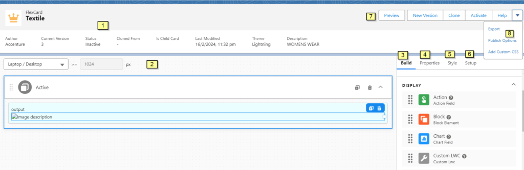
1. Header
The Header provides key details about your FlexCard, such as the Author, Version, and Status. You can interact with your FlexCards by previewing, copying, activating, exporting, adding custom CSS, creating a new version, and accessing resources through the Help link.
If your FlexCard is active, you can download its LWC, deactivate it and adjust the Publish Options.
2. Canvas
We have the option to select various elements from the toolbox, such as text, buttons, charts, and images. These elements can be dragged onto the canvas in the desired location. Additionally, we can adjust the width of the elements to make them larger or smaller.
By using the “Viewport Dropdown” we can preview how the content will appear on phones, tablets, and desktops.
3. Build Panel
Create a FlexCard in the FlexCards Designer by dragging various elements such as data fields, states, actions, reusable FlexCards, custom LWC, data tables, images, and more from the Build panel onto the canvas.
If you want to have different sections or versions of your card, you can easily add “States” similar to different pages in a book. Additionally, you have the option to embed custom components (“LWCs”) or other pre-built “FlexCards” into your main card.
4. Properties Panel
When you choose an item on the canvas, you can adjust its properties through the Properties panel to control how the item functions.
For example, if you select the Image element from the build panel, you can modify its height, width, size, and title using the Properties panel.
5. Style Panel
Use the Style panel to customize the appearance of elements such as backgrounds, sizes, borders, padding, margins, height, and fonts. You can also preview the changes in real-time.
For more specific design needs, you can create and apply custom CSS. Save your style settings on one element and effortlessly apply them to multiple elements on the FlexCard.
6. Setup Panel
The Setup panel within the FlexCard Designer offers several choices for configuring the behaviour of the FlexCard.
Users can modify their data source, apply specific permissions to restrict access, track custom data on elements with enabled tracking, activate Multi-Language and OmniScript Support, establish Session Variables, create Event Listeners, and much more.
7. Preview
Get a glimpse of your FlexCard in real time to evaluate its design and functionality. Check out how the FlexCard appears on various devices like mobile, desktop, and tablet using the Viewport Dropdown.
Enhance your preview experience by adding Test Parameters to explore your FlexCard with different settings, such as record IDs and pagination limit.
8. Publish
Publish Options allows you to specify where a component can be published, including the API version and description. You can also add a custom SVG icon for your LWC in both Experience Builder and Lightning App Builder.
Before publishing to a Lightning or Community page, define metadata values and update the SVG icon for your FlexCard LWC. Enable the Community Page option under Targets in Publish Options to make your FlexCard visible on a Community page.
Build a FlexCard with the FlexCard Designer

Functionality of Flexcard Designer
The FlexCard Designer offers several key features that allow you to create and customize your FlexCards with ease. Here are some of its highlights:
- Easily drag and drop customizable elements from the Build panel onto the Canvas.
- Adjust the width of any element using a 12-column horizontal grid.
- Customize the look and feel of your FlexCard using the Style panel. Use the graphical user interface (GUI) to select colours for texts, borders, and backgrounds, change font sizes, and make elements responsive.
- Access In-Product Help to learn about specific properties or elements without leaving the Designer.
- Take advantage of the types of Action to launch OmniScripts or Flyouts and trigger Custom or Pubsub Events, among other functionalities.
- Download FlexCard LWCs both on and off-platform to view code and debug any issues that may arise.
Want to Learn Salesforce Flows? Checkout our Salesforce Flow Course
FAQs
1. How does Flexcards differ from Flexcards Designer?
Flexcards are the cards, or we can say interactive mini-apps that we create with data, actions, and visuals whereas, Flexcard Designer is a creative workspace where you put together the different elements to design and build your FlexCard. FlexCards – The “what” – the final interactive product. FlexCard Designer – The “how” – the tool you use to build that product.
2. Can we call FlexCard from OmniScript?
Yes, we can call a FlexCard LWC in an OmniScript using the Custom LWC Element. The FlexCard can receive data from the LWC OmniScript and perform actions in the FlexCard.
In an LWC-enabled OmniScript, add the Custom LWC element to a Step. In the Custom LWC’s Lightning Web Component Name property, enter the FlexCard component’s name, prepended with “cf” (ex – cfContactCard).
Read more – Omnistudio in Salesforce
Conclusion
FlexCards in OmniStudio empower you to build interactive mini-apps without code! Design visually with drag-and-drop tools, then customize appearance and behaviour with powerful panels. Explore, create, and publish seamlessly within the FlexCard Designer. Dive in and build something amazing!